Slider Settings
Contents
- Important Note about Slider Settings:
Depending on your Slider Type, not all settings listed in this article will be applicable for your slider. For example, the Carousel Settings will only be shown when your "Slider Type" is set to "Carousel", and Navigation Settings will not be shown for a "Hero Scene" slider.
1. Primer - Settings Previews
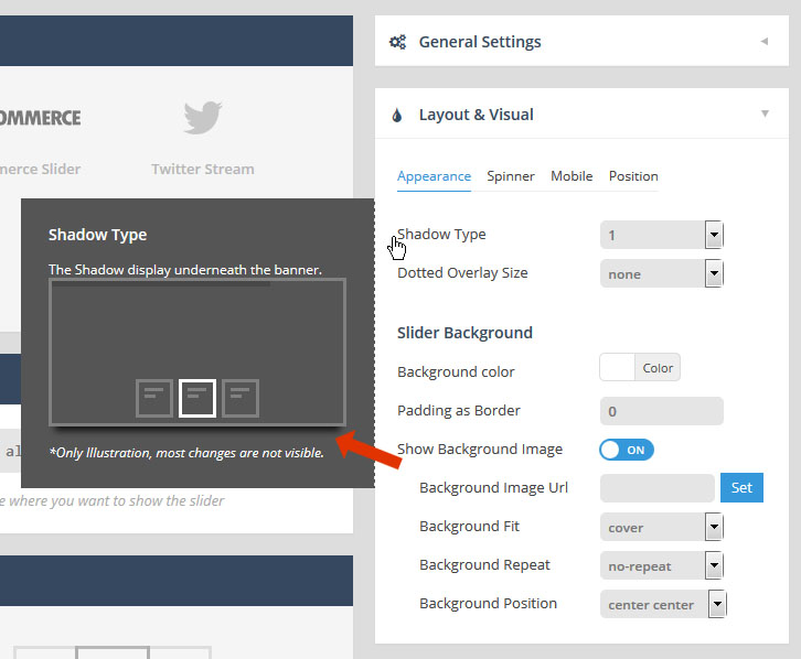
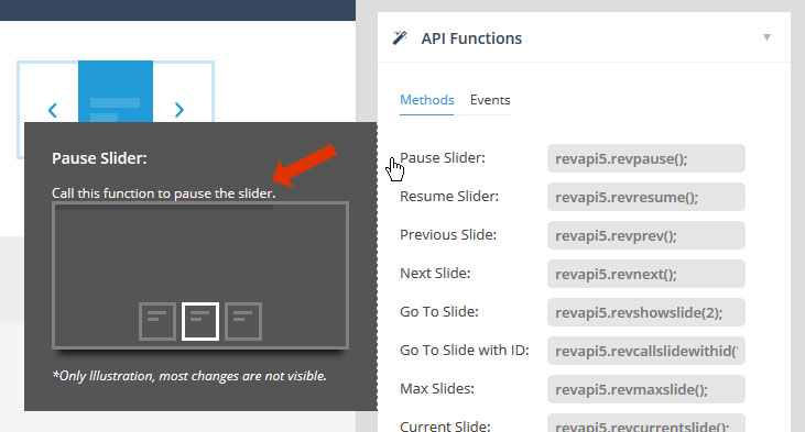
As you may have noticed, when adjusting your slider’s settings, a small preview box will be shown to illustrate each setting. This is particularly useful for settings such as “Appearance”, “Navigation”, etc., as it will give you a quick visual of the specific setting.
In the following screenshot, “Shadow Type 1″ is illustrated in the hover preview box.
2. General Settings
back to menu2.1 Slideshow
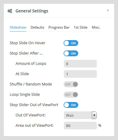
Stop Slide on Hover
Stop slider progress when the user hovers their mouse over the slider.
Stop Slider After..
- Amount of Loops:
Stop the slider after all slides have looped a set amount of times. - At Slide:
Stop the slider at a specific slide.
Shuffle / Random Mode
Stop slider progress when use hovers their mouse over the slider.
Loop Single Slide
Stop slider progress when use hovers their mouse over the slider.
Stop Slider out of Viewport
Stop slider when the page is scrolled and the slider is no longer visible.
- Out of Viewport:
- Wait:
Only start the slider when its scrolled into view (useful for sliders further down the page). - Pause:
Pause the slider when its scrolled out of view.
- Wait:
- Area out of Viewport:
A percentage of the slider that needs to be inside/outside the viewport before slider starts or pauses.
2.2 Defaults
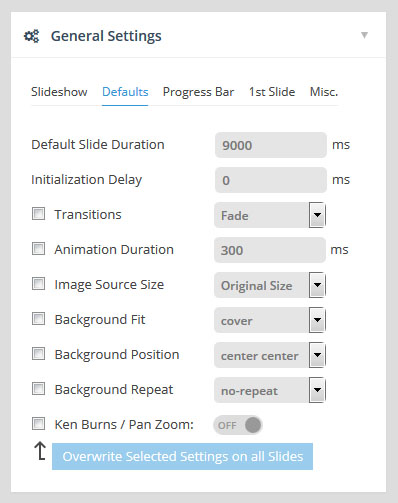
back to menuSet the default individual slide settings.
For example, let’s say you always want your individual slides to start off with a “Slide to Top” transition. Adjusting the “Transitions” value will set it up so all new slides have have a “Slide to Top” transition by default.
Or if you already have individual slides created, you can change the value of “Transitions” and then select its checkbox, and then click the “Overwrite Selected Settings on all Slides” button, and the main transition for all existing slides will be changed to the new default value.
2.3 Progress Bar
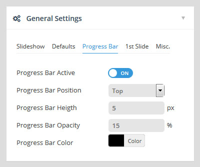
back to menuThe timer line that illustrates the amount of time before the next slide is shown.
If active, choose the progress bar’s position (top or bottom of slider), its height in pixels, and also its color and transparency level.
2.4 First Slide
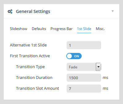
back to menuAlternative 1st Slide
Normally the slider will always start with slide #1. But if you’d like your slider to start with a different slide, enter the slide’s number here.
First Transition Active
Sometimes when your slider first starts, it’s more elegant to have a different transition such as a simple fade at the very beginning. Use this option if you’d like to specify a special, initial transition for the very first slide.
When set, the special transition will only be executed on the very first slide once. Then once the slider loops, the original slide will default back to its individual slide transition settings.
2.5 Misc.
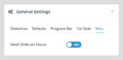
back to menuNext Slide on Focus
Browser behaviour varies when switching between windows/tabs (JavaScript stops executing, etc.). But the “Next Slide on Focus” option will often correct slider issues related to switching between tabs and windows.
3. Layout & Visual
back to menu3.1 Appearance
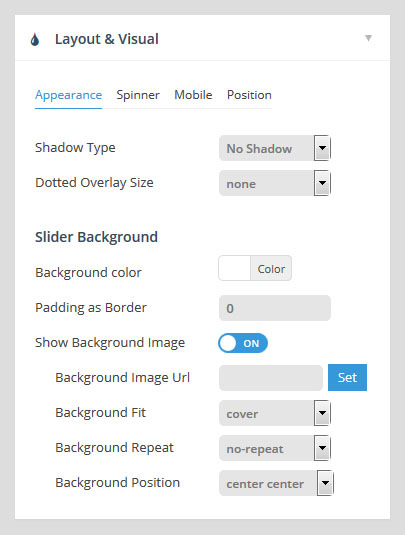
Shadow Type
Shadows will be shown beneath the slider. Choose between 6 different styles, or choose “No Shadow” (the default option). And preview the Shadow Type as shown in the Primer section above.
Dotted Overlay Size
Dotted overlays are transparent grid-like graphics that will be placed above the slides, giving the slider a “mesh” type look (4 styles available). Preview the options as shown in the Primer section above.
Slider Background
The slider’s main background. Normally if your individual slides have their own background images, the slider’s main background would only be visible when the slider first loads, and before the first slide displays. But setting a background here for the slider itself is particularly useful for when you’re using “Transparent” slides (slides with no background image).
Choose a solid color or set an image as the background. Apply some padding to give your slider a border. And set specific background image options such as Background Fit, Background Repeat, and Background Position.
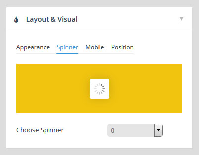
3.2 Spinner
back to menuThe slider's animated preloader graphic.
The spinner will be shown when the slider first loads, and also for additional slides if LazyLoad is being used. Choose between 6 different spinner styles, or choose “Off” for no spinner.
3.3 Mobile
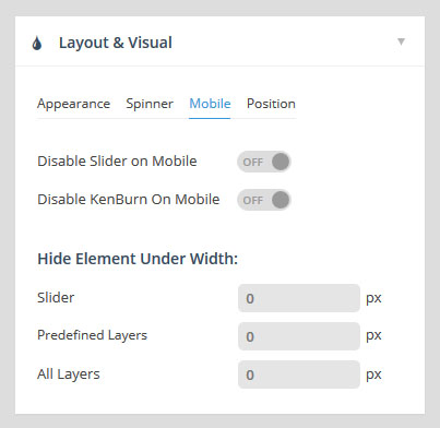
back to menuDisable Slider on Mobile
Choose to disable the entire slider on mobile devices. If disabled, you can replace the slider with a simple fallback image.
Disable Ken Burn on Mobile
The Ken Burns effect is an advanced animation that looks great on desktop computers, but for mobile devices, providing a more simple slider can sometimes be a better user-experience. Depending on your preference, toggle the KenBurns effect on and off for mobile with this setting.
Hide Element Under Width
Choose to hide the entire slider, individual layers, or all layers when the screen size is below a specific pixel width (i.e. 640px, etc.).
Hiding layers is useful for when lots of content displays nicely on desktop, but there isn’t really enough real estate (screen space) to fit everything on mobile.
“Predefined Layers” are specific layers you’ve designed to “hide” under the pixel width set here for this setting.
3.4 Position
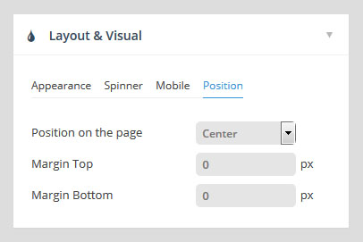
back to menuPosition on the page
The default alignment for the slider. Options are “left”, “center” or “right”.
Margin Top, Margin Bottom
Add some space above or below the slider in relation to other content on the page. Both positive and negative numbers supported.
4. Navigation
back to menu4.1 Common Options: Visibility & Position
Arrows, Bullets, Tabs and Thumbs all have similar “Visibility” and “Position” options, which will be described here in the “Common Options” section for brevity.
4.1.1 Visibility
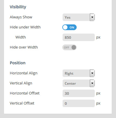
Always Show
Yes = Show navigation element at all times
No = Only show navigation element on mouse hover
Hide Under Width
Disable navigation element below a certain screen width. For example, thumbnails look great on desktop, but are often better hidden on smaller screens.
Hide Over Width
Disable navigation element above a certain screen width.
- Practical application of "Hide Under Width" and "Hide Over Width" combined:
Combining these two options is particularly useful for switching between two different navigation types depending on the screen size:
Tabs -> Hide Below Width -> 850px
Bullets -> Hide Over Width -> 850px
RESULT:
Tabs will be shown above 850px screen size (desktop)
Bullets will be shown below 850px screen size (mobile)
4.1.2 Position
Horizontal Align / Horizontal Offset
Horizontal Align: Align navigation to the left, right or center of the slider.
Horizontal Offset: Apply a left/right margin to the navigation in relation to its horizontal alignment (positive and negative numbers supported).
Vertical Align / Vertical Offset
Vertical Align: Align navigation to the top, bottom or middle of the slider.
Vertical Offset: Apply a top/bottom margin to the navigation in relation to its vertical alignment (positive and negative numbers supported).
4.2 Arrows
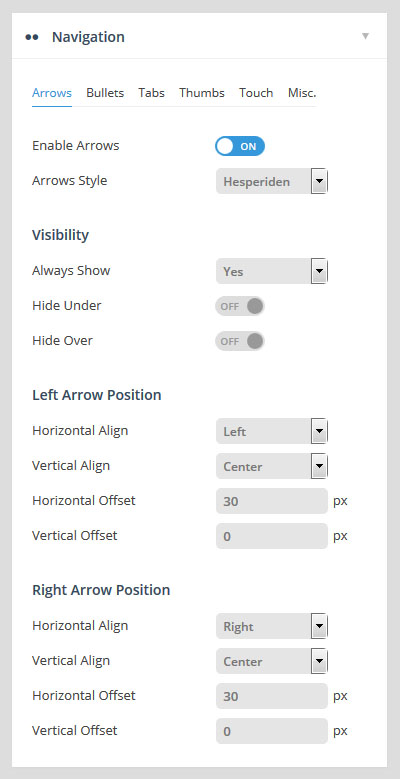
back to menuEnable Arrows / Arrow Style
Choose to enable/disable navigation arrows, and if enabled, choose between 15 different pre-built styles.
Visibility, Left/Right Arrow Position
See Common Navigation Options above.
4.3 Bullets
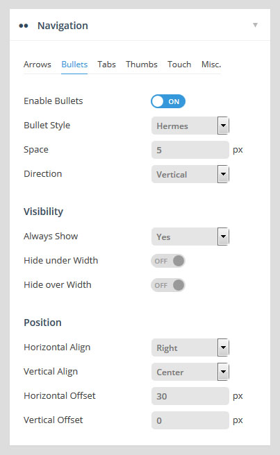
back to menuEnable Bullets / Bullet Style
Choose to enable/disable navigation arrows, and if enabled, choose between 15 different pre-built styles.
Space / Direction
Set the spacing between the bullets in pixels, and choose if the bullets should be displayed horizontally (bullets displayed side by side) or vertically (bullets placed on top of one another) .
Visibility, Position
See Common Navigation Options above.
4.4 Tabs / Thumbs
back to menu- Quick Note:
Tabs and Thumbs share the same exact options, and are combined here in this section for brevity.
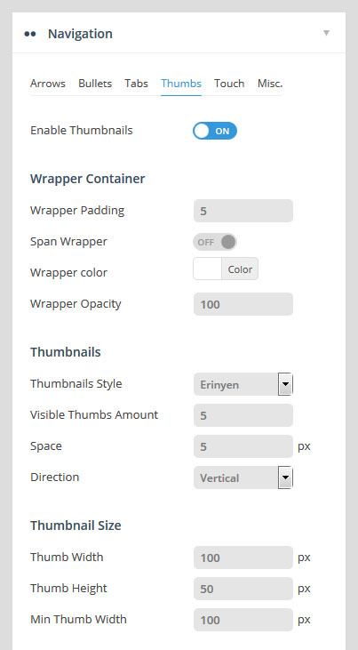
Wrapping Container
Wrapper Padding:
Space between edge of slider and edge of thumbs/tabs container.
Span Wrapper:
ON: thumbs/tabs will always be stretched across the full size of the slider.
OFF: thumbs/tabs will be stretched to the slider’s Layers Grid.
Wrapper Color / Opacity
Adjust the color and opacity of the tab/thumbs section. Will only be visible if either “Space” or “Wrapper Padding” exists.
Style, Visible Amount, Space & Direction
Style:
Choose between 7 different pre-built styles.
Visible Amount:
The amount of thumbs or tabs that will be visibly shown. For example, if you have 7 slides, but only want 3 thumbnails to be displayed, technically the thumb strip will still contain 7 items, but only 3 thumbs will be visible at any given time, and the additional thumbs will only be shown on mouse-movement.
Space / Direction
Set the spacing between the tabs/thumbs in pixels, and choose if the they should be displayed horizontally (side by side) or vertically (placed on top of one another) .
Width, Height, Min. Width
Set the tab/thumb width and height. The width will act as a “Max Width”, and the “Height” will resize proportionally.
For example, let’s say the slider itself was resized down by 50% for mobile. If the thumb width/height were set to 100×50, the thumb size would also be resized down by 50%, and the new thumb width/height would be 50×25.
However, this is where the “Min Width” value is useful. For example, let’s say the thumb width/height were set to 100×50. If the “Min Width” were also set to “100px”, the thumbnails would never resize down.
Visibility, Position
See Common Navigation Options above.
4.5 Touch
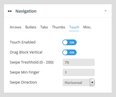
back to menuTouch Enabled
Choose to enable/disable touch navigation for mobile. If enabled, swiping the slider left or right with your finger will change slides back and forth.
Drag Block Vertical
Allow for the page to be scrolled vertically when “touch” is enabled. For example, when “ON” is applied, “swiping” the slider in a vertical direction will also scroll the page itself. But when set to “OFF”, the page itself will not be scrolled when swiping the slider in a vertical direction.
Swipe Threshold, Min. Finger
Threshold
The swipe action sensitivity. A smaller number would mean that only a short “swipe” is needed for the slide to change. A larger number would mean that a more elaborate “swipe” would need to take place for the slide to change.
Min. Finger
The number of fingers needed for a “swipe” action to be registered. “1” finger is usually best, as that’s what most users are used to, but depending on your site you can require that users use two fingers to “swipe”, etc.
Swipe Direction
Horizontal:
Traditional left-to-right touch-swipe navigation.
Vertical:
Useful for when your slide animations are set to “Slide Vertical (Next/Previous)”. In this case, swiping up or down would change the slides.
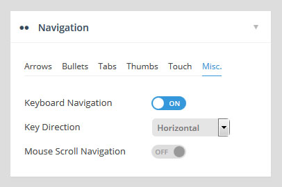
4.6 Misc.
back to menuKeyboard Navigation
Choose to enable arrow keys to navigate between slides.
Key Direction
Vertical:
Up and down keys will act as “next / previous” controls for the slider.
Horizontal:
Left and right keys will act as “next / previous” controls for the slider.
Mouse Scroll Direction
Capture mouse-wheel movement to change between slides.
5. Parallax
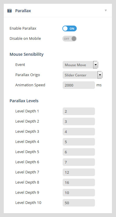
back to menuEnable Parallax / Disable on Mobile
Choose to enable the parallax effect for the slider, and if enabled, choose to disable the effect for mobile only (since parallax is based on mouse movement and page scrolling, parallax usually works best on desktop computers).
Mouse Sensibility
Event:
Choose “Mouse Move”, “Scroll Position” (page scrolling) or “Move & Scroll” (first two combined).
Parallax Origin:
“Mouse Enter Point” – Parallax is based on where the mouse first entered the slider.
“Slider Center” – Parallax is always based on the very center point of the slider (usually the best option).
Animation Speed:
The transition duration for the content’s movement. Use a lower number such as “750” for fast movement, and a higher number such as “2000” for smoother motion.
Parallax Levels
Each individual layer can be assigned a “Parallax Level”. And you can define up to ten different “levels”.
Applying different levels to different slide layers is what gives the content its “depth” in relation to other parallax layers. In this example, you’ll notice that some content layers have less movement than others. This is because the different layers have different “Parallax Levels” assigned.
When choosing your parallax level values, a smaller number would mean less movement, and a higher number would allow for a larger amount of movement.
6. Performance and SEO Optimization
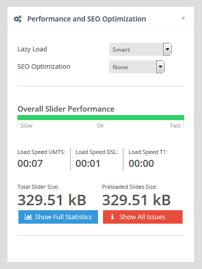
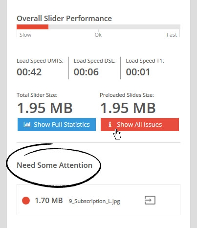
back to menuIn this section you can choose from multiple Lazy Loading options to help speed up the slider’s initial loading, and also evaluate your slider’s overall file-size footprint, which is helpful for making sure all of your images are reasonably sized for web.
Lazy Load
All:
Load all images in the slider after the page initially loads, ensuring no delays between slide content when switching between slides.
Best for sliders with advanced navigation such as thumbnails, bullets and tabs.
Smart:
Load images from the very first slide after the page initially loads, and also preload images from neighboring slides. For example, when the slider first loads, the 2nd slide will be preloaded in anticipation of the slider changing. And then once the 2nd slide is viewed, the 3rd slide would then be preloaded, and so on.
A great option for sliders that only contain basic navigation, where progression is always “next” or “previous”.
Single:
Always load slide content “on demand”. Meaning only the first slide will be initially loaded, and subsequent slides will only be loaded when it’s their turn to be shown in the slider.
No Lazy Loading:
All content will be loaded when the page first loads. Often ok for sliders with minimal content. Not recommended for sliders with lots of slides and/or content.
SEO Optimization
Choose to load images in a “No Script” tag for optimal SEO.
Overall Slider Performance
The green bar shown in the screenshot to the right is a general evaluation based on your LazyLoad choice, and the average image sizes you’re using in the slider.
Toggle between the LazyLoad options to see the estimated Load Speed between common internet speeds such as DSL, Cable (T1), etc.
Show Full Statistics:
View a detailed listing of Image Performance, Google Fonts, etc.
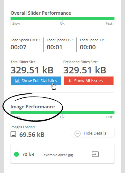
Show All Issues:
View items that could be slowing down your slider.
In the example screenshot to the right, the background image being used for the first slide is 1.7mb, which is much larger than it should be for web.
Reducing the file size for this image in Photoshop (using the Save for Web option) to a more reasonable size such as 300kb or lower will dramatically improve the slider’s performance.
7. Problem Handlings
back to menu7.1 Fallbacks
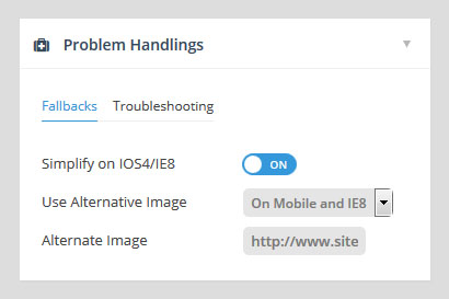
For compatibility with older mobile devices and legacy IE, you can choose to simplify the slider’s functionality or replace it with an alternative image.
Simplify on iOS4/IE8
Animations will be set to simple “fade” for older iOS and IE, which will will dramatically improve performance for these environments.
Use Alternative Image
Choose to use an alternative image in place of the slider for mobile devices, IE8, or both. When an alternative image is used, enter the image’s absolute url into the “Alternative Image” field.
7.2 Troubleshooting
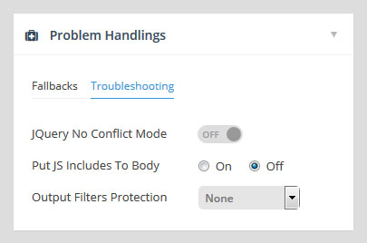
back to menuUse the troubleshooting options to solve common conflicts with other plugins and themes.
jQuery No Conflict Mode
Using jQuery noConflict is considered best practice for WordPress, and Slider Revolution uses this by default. But sometimes another theme or plugin may not be built using this best practice, which can often cause a conflict. In these cases, setting this option to “OFF” can sometimes resolve this issue.
Put JS Includes to Body
Often solves conflicts with “minify” plugins and also certain themes that don’t call “wp_head()” properly.
Output Filters Protection
Sometimes a theme runs special filters over the page’s content (against WP best practices), which results in breaking the slider’s HTML markup (if you view the slider’s HTML source in your browser, you’ll often find “<p>” tags injected throughout the slider’s markup).
The “Output Filters Protection” option will attempt to combat this conflict. “By Echo Output” will often place the slider above all other content on the page, which is fine for sliders that are originally placed above the other page’s content to begin with, but when the slider is meant to be shown below other page content, “By Compressing Output” is best.
8. Import / Export / Replace
back to menu8.1 Import
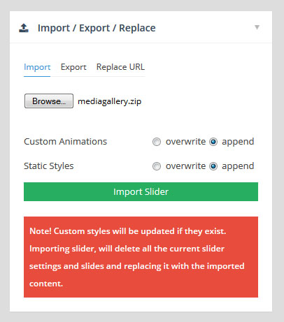
Overwrite current slider settings and slides with those from the imported slider zip.
Browse
Select the slider import zip from your computer.
Custom Animations / Static Styles
Overwrite:
Overwrite previous styles and animations with those from the imported slider.
Append:
Preserve previous styles and custom animations (usually the best option).
8.2 Export
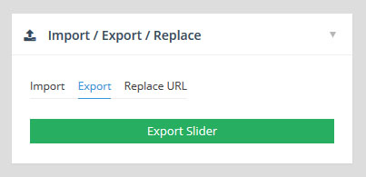
back to menuExport the current slider, creates a “zip” file that can be saved to your computer for later usage (i.e. “imported” to a different website).
8.3 Replace URL
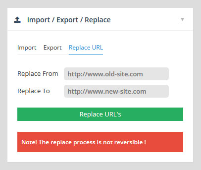
back to menuImage URL’s in your sliders are stored as absolute urls, so if you’re moving your site from one domain to another (such as localhost to a live site), this tool can be used to update urls for the slider’s images with the new site’s domain name.
Replace From:
The base url from the old site’s domain.
Replace To:
The base url of the new site’s domain.
9. API
back to menuExtend the slider’s functionality with API methods and events.
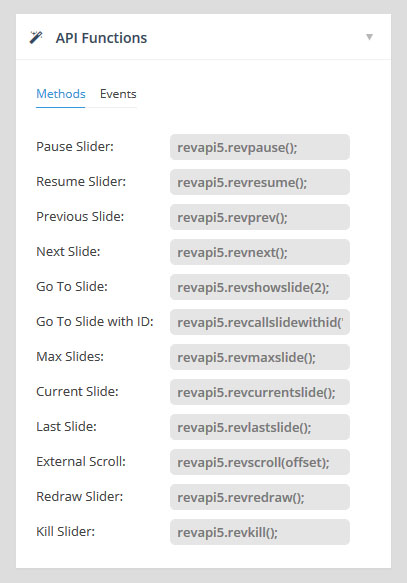
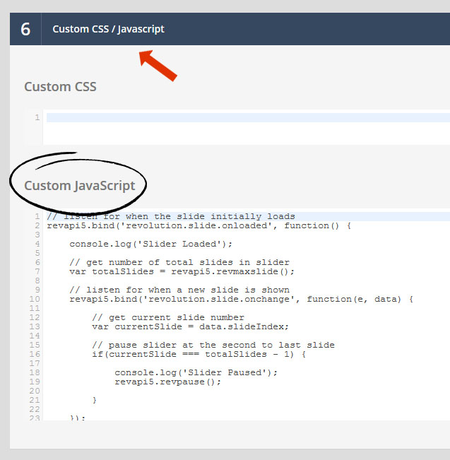
Extend the slider’s functionality with API methods and events. All of the available methods and events are listed in this section of the slider’s settings, and can be copied and pasted directly from this section into the slider’s Custom JavaScript section.
Each slider will have its own unique API variable which is based on the slider’s ID. In the screenshot to the right, the API variable is “revapi5″, but this will vary depending on your particular slider.
Hover your mouse over each code sample for brief explanations of each method or event.
The following is a quick sample of using the slider’s API, where we’ll pause the slider when the second to last slide is shown.
1 2 3 4 5 6 7 8 9 10 11 12 13 14 15 16 17 18 19 20 21 22 23 24 25 26 27 | // listen for when the slider initially loads revapi5.bind('revolution.slide.onloaded', function() { console.log('Slider Loaded'); // get number of total slides in slider var totalSlides = revapi5.revmaxslide(); // listen for when a new slide is shown revapi5.bind('revolution.slide.onchange', function(e, data) { // get current slide number var currentSlide = data.slideIndex; // pause slider at the second to last slide if(currentSlide === totalSlides - 1) { console.log('Slider Paused'); revapi5.revpause(); } }); }); |
10. Google Fonts
back to menuChances are your theme is already loading Google Fonts that you can use for your slider’s text, but you can also load whatever new Google Fonts you want for your sliders.
To get started, click the “Add New Font” button.
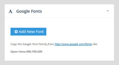
Next, visit the Google Fonts website and choose a font you wish to use. Then click the “Quick Use” icon.

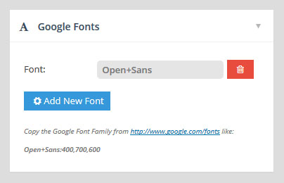
Then copy the font slug from the url as shown in the following screenshot (after the “font=” part, and without the single quote character).

Then paste the Google Font slug into the slider’s “Add New Font” field.
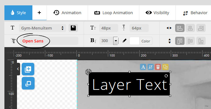
And now the Google Font will be available for your slider’s Layer text.
11. Carousel Settings
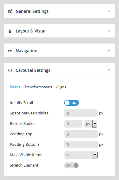
back to menuAny slider can be displayed as a super-flexible carousel. To see an example, just choose “Carousel” for your slider’s Slider Type.
Once the “Slider Type” is set to “Carousel”, the “Carousel Settings” will appear beneath the “Navigation” section.
11.1 Basics
Infinity Scroll
OFF: Carousel will have a “beginning” and an “end”. Meaning when the end is reached, the slider will not automatically loop, and the only way to view previous slides would be to navigate backwards.
ON: The carousel will loop infinitely. Meaning when the last slide is reached, the next slide shown be be a copy of the very first slide, and so on, allowing you to click forward endlessly.
Space Between Slides
In a carousel format, normally items are shown as “blocks” that have spaces between them. This spacing is optional, but if you want to display a traditional carousel look, add some spacing here.
Border Radius
Add rounded corners to your carousel items by applying a pixel value here. Or to achieve perfect circles, add a “50%” border-radius.
Padding Top / Padding Bottom
Add some padding to the top and bottom of the carousel items, creating some extra space for the items in relation to the rest of the page’s content.
Max Visible Items
Represents the number of items that will be visible. For example, using the number “3”, the selected slide will be centered in the carousel, and then there will be 1 carousel item to the right (representing the “next” slide), and 1 carousel item to the left (representing the “previous” slide).
Stretch Element
The selected carousel item will be stretched to cover the entire size of the slider.
When this option is used, “previous” and “next” carousel items will not be visible, regardless of the “Max Visible Items” value.
11.2 Transformations
back to menu- Special Note:
A brief explanation of Varying Fade, Varying Rotation and Varying Scale
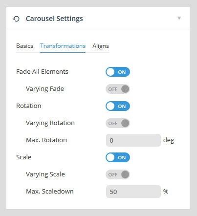
When a “varying” option is enabled, it means that the calculation will be based on the position of the item in relation to the currently selected item.
For example, let’s say you have a carousel with 5 visible items, and a “Varying Scale” of “50%”. When you cycle through the carousel items, the 5th item on the right will be scaled to 50%. Then when the 5th item becomes the 4th visible item, it will be scaled to 75%. And then when it finally reaches the center of the carousel, it will be scaled to 100%.
But when no varying option is used, with the same carousel (5 visible items), the 5th item will have a 50% scale. And then when it becomes the 4th visible item, it will still have a 50% scale. And then when it finally reaches the center of the carousel, only then will it scale from 50% to 100%.
Fade All Elements
All previous and next carousel items will be semi-transparent.
Varying Fade – See Special Note above.
OFF: Fading will only occur for immediate neighboring items.
ON: Fading will occur throughout the visible cycle of the item.
Rotation
Apply a “skew” to items when the carousel progresses forward and back (this gives the effect of a window opening from the side). Degree values ranging from 45 to 180 usually work best.
Varying Rotation – See Special Note above.
OFF: Rotation will only occur for immediate neighboring items.
ON: Rotation will occur throughout the visible cycle of the item.
Scale
Scale previous and next slides down based on a percentage.
Max Scaledown
The percentage to scale previous and next items down. For example, 50% would means that previous and next slides would be resized to half the size of the selected carousel item.
Varying Scale – See Special Note above
OFF: Scaling will only occur for immediate neighboring items.
ON: Scaling will occur throughout the visible cycle of the item.
11.3 Aligns
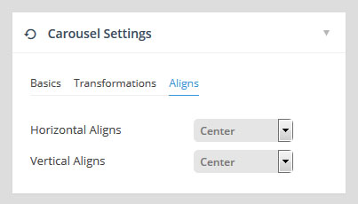
back to menuChoose a vertical and horizontal alignment for the carousel’s main item. For example, if the alignment is set to “right center”, when the the main selected item comes into focus, it will be aligned to the very right of the slider’s layout.
